Bartifier
Industry Bartifier
Exploration 20
homepage concepts Website 16
pages designed Live bartifier-20b522-6fq3dny48-rotimis-projects-0ae95860.vercel.app
Design Exploration
Concept 09 · v1Selected design
Serve It Forward
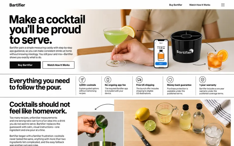
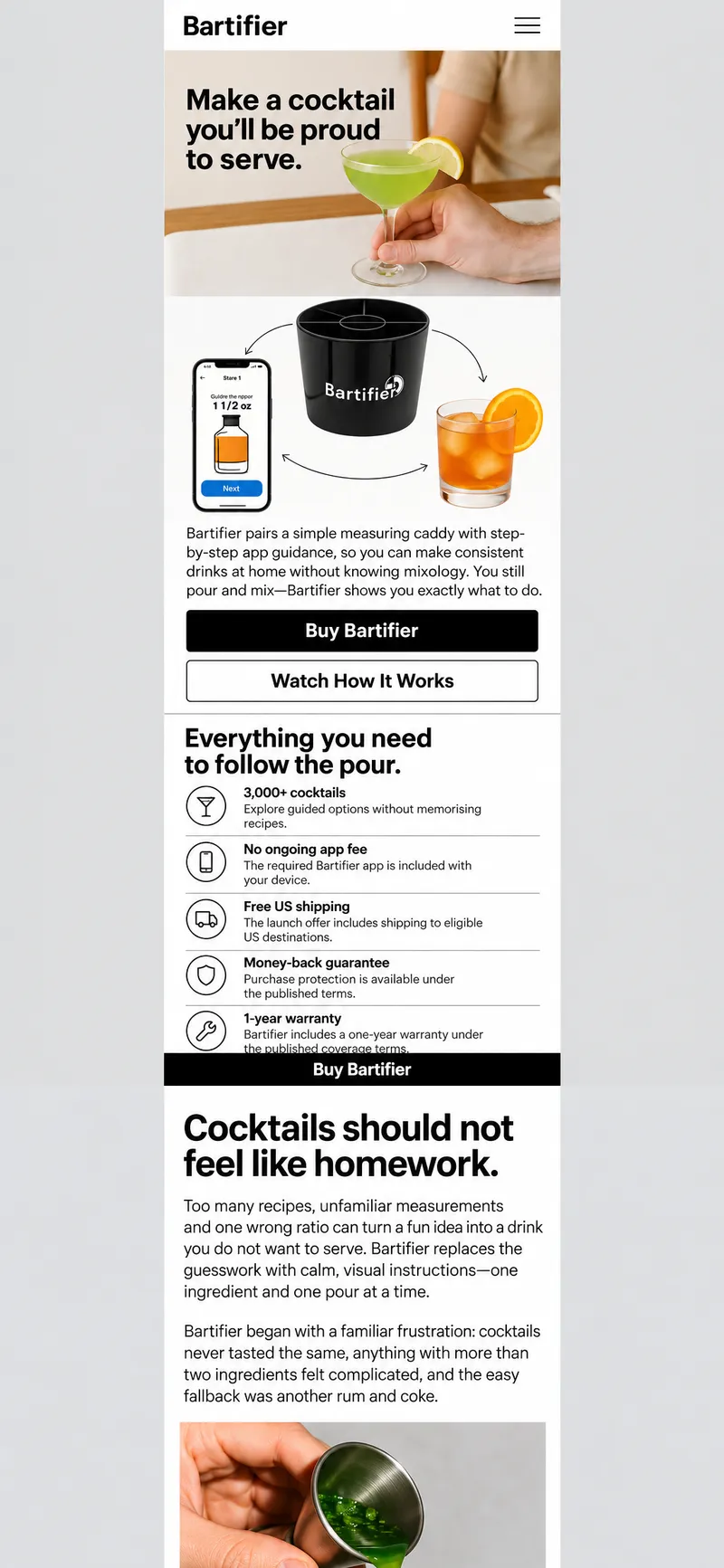
Begin at the social result and tell the story backward. The first screen is a bright, daytime table where someone is placing down an achievable cocktail; scrolling rewinds through mixing, pouring, measuring, choosing the drink and entering available ingredients until the visitor arrives at the Bartifier offer that made the sequence possible.
Concept 09 · v2
Serve It Forward
Begin at the social result and tell the story backward. The first screen is a bright, daytime table where someone is placing down an achievable cocktail; scrolling rewinds through mixing, pouring, measuring, choosing the drink and entering available ingredients until the visitor arrives at the Bartifier offer that made the sequence possible.
Concept 10
The First Good Drink, Edited
Treat Bartifier’s buying case as a carefully edited feature about achieving a first successful cocktail, rather than as a conventional gadget sales page. The first screen is one believable home photograph containing the Bartifier, the real app and an achievable finished drink, accompanied by the approved headline and a direct purchase action. Each following section is reduced to its strongest evidence: one numbered fact, one captioned action or one decisive line from the approved copy.
Concept 11
The Evening Edition
Present Bartifier as the confidence to become the person making the drinks tonight. The first screen is a monochrome, evening-at-home portrait scene that visibly includes the Bartifier and phone; the approved hero headline crosses the image at editorial scale while a compact light purchase panel keeps the offer unmistakable. The site then unfolds as an indexed evening edition rather than a conventional sequence of product cards.
Concept 12
The Straight Answer
Make the website a black-and-white buyer’s dossier that answers the unfamiliar-product questions without ceremony. The first screen is a typographic poster using the approved hero headline at enormous scale, interrupted by the physical Bartifier and a real app screen. Beside it, the current Shopify offer, free-shipping line and primary action are set with the clarity of a front-page fact box.
Concept 15
The Guided Ratio
Make Bartifier’s operating logic the central visual object. The first screen is a large overhead diagram of the divided caddy, overlaid with three plainly worded relationships: the app chooses the step, the highlighted sections show the quantity and the user pours and mixes. The approved hero headline, real app screen, current offer and purchase action lock into the same grid.
Concept 19
One Good Drink
Trust one photograph and approximately forty words to make Bartifier feel considered, calm and credible. The first screen is a solitary still life of the device, a phone showing one real instruction and one attainable finished cocktail, accompanied only by the approved headline, short explanation, price route and two actions.
Concept 20
An Invitation After Dark
Sell Bartifier through the intimate moment just before a first drink is served at home, not through nightclub spectacle. The first screen is a full-bleed evening photograph of a kitchen or dining table with the device and lit app clearly visible in a pool of lamplight, while the approved headline reads like a personal invitation.
Concept 21
First Drink, Front Cover
Make the beginner—not a mixologist—the campaign star. The first screen is a direct-flash portrait of a real first-time user at a kitchen counter, confidently holding an achievable finished drink while the Bartifier and phone remain unmistakably present in the frame.
Concept 22
The Useful Object
Build a heritage-style product folio around verifiable invention and craft rather than inventing a long company history. The first screen is a monumental macro photograph of Bartifier’s central ring and divided sections, with a real app screen tipped into the composition like an annotated plate.
Concept 23
Your Place, First Round
Make the website behave like a gracious boutique host preparing someone for their first round at home. The first screen is a wide, believable kitchen or dining-room scene with the device and phone waiting at a place setting, followed immediately by a reservation-like purchase bar for one or two Bartifiers.
Concept 24
YOU POUR. IT GUIDES.
Turn radical honesty into the visual identity. The approved hero headline fills the first screen behind an enormous cropped Bartifier, while blunt statements—APP REQUIRED, YOU STILL POUR and ALCOHOL NOT INCLUDED—are treated as principal claims rather than fine print.
Concept 25
Four Moves, Full Color
Turn Bartifier’s beginner process into four joyful color fields: CHOOSE, MEASURE, POUR and SERVE. The first screen is an interactive horizontal sequence containing the real product and phone as cutouts; tapping or swiping advances through the four actions while the purchase action remains fixed and visible.
Concept 42
The Proof Counter
Make Bartifier feel immediately purchasable by turning the first screen into a polished product counter. A high-key Bartifier and phone sit beside the approved headline, launch prices, stacked one-unit and two-unit choices, and compact badges for 3,000+ cocktails, no ongoing app fee and free US shipping. The site answers each buying question with a product view, a number, a demonstration or a verified proof point rather than a long claim.
Concept 43
The First Round
Present Bartifier as the small act that lets a beginner confidently serve the first round. The first screen is a full-width documentary photograph of someone using Bartifier in a believable daylight kitchen, with the real app instruction visible and the finished drink within reach. The product is pinned directly into the scene so aspiration never replaces proof of how it works.
Concept 44
The Kitchen Workbench
Treat Bartifier as a useful invention shaped through hands-on problem solving. The opening is an overhead workbench photograph: device, phone, familiar ingredients, testing notes and one finished drink arranged around the approved headline. The story is told through hands, materials, pours and evidence of making rather than polished lifestyle poses.
Concept 45
Pour Along
Make the website behave like a friendly visual coach. The first screen places the real Bartifier and phone inside a softly illustrated kitchen scene; tapping the muted demonstration advances from app instruction to filled section to pour. Reassurance is shown through friendly hands, arrows and short steps rather than through lengthy explanation.
Concept 46
The Ingredient Wreath
Build the brand around Bartifier’s circular physical form and the question of what is already on the shelf. The first screen is a centered overhead still life: Bartifier in the middle, the phone beside it and familiar ingredients arranged as a loose wreath around both. Soft ingredient swatches and shaped image windows replace conventional feature cards.
Concept 54
The First-Pour Programme
A cultural-editorial interpretation that turns the site into a lively programme for the visitor’s first successful drink. The homepage opens as a poster, then becomes a listing of what can be explored now: watch the pour, try the ingredient idea, understand the app, compare approaches, read a beginner guide or choose an offer. It presents a programme of useful experiences without pretending they are literal events.
Concept 55
The Invention Ledger
A heritage interpretation grounded in Bartifier’s actual invention story rather than fabricated age. The site documents the progression from inconsistent drinks and recipe frustration to a divided measuring tool, a guiding app and the customer’s first successful pour. Only approved sketches, prototypes, founder material, milestones and dates appear; missing evidence is omitted rather than recreated as fake history.
Concept 65
The Measured Grid
Make the site’s layout demonstrate Bartifier’s thinking. A visible grid assigns one cell to each choice and action, while the circular product repeatedly breaks through the orthogonal structure. The first screen is an oversized version of the approved headline occupying several cells, with the product crossing a grid boundary, the real app screen in another cell and the purchase action held in a stable final cell.
Serve It Forward
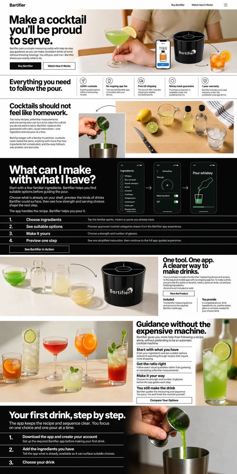
It gives the site hospitality and human warmth without allowing lifestyle imagery to replace product proof. The backward sequence makes the first successful drink the emotional center while still explaining every required action.

The Full Website
Bartifier App Page
Shopping Cart
Cocktail Discovery Page
Comparison Hub
Bartifier vs Pod Machines
Bartifier vs Manual Recipes
Beginner Guides Library
Beginner Guide Article
One design, made into a page for each article slug.
How It Works Story
Partner Inquiry Page
Policy Pages
One design shared by every page of its kind.
Bartifier Product Page
Responsible Use and Alcohol Notice
Support Centre
Order Confirmation and Getting Started
See It Live
Your business Audience Required next steps